 I attended Prof. Edward Tufte (or ET for short) workshop on Presenting Data and Information in Denver on July 31, 2015. Since I had attended his workshop decades before, my motivation was to observe what was “new and innovative” in data visualization. To my surprise, I was rewarded with the “old and enduring” in classic ET style. He is the elder statesman of data viz, where paper, typography and cartography take honored places within his instruction. His style is a potpourri of perceptive design principles interwoven with examples across disciplines and centuries.
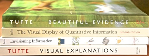
His workshops always starts with study hall for the initial hour, during which attendees are expected to read 6-8 long excerpts from his materials. Although awkward at first, this routine was useful and sets the mood for the day. As part of the $380 fee, attendees receive three inches of dense material, consists of four of his books plus handouts.
Chopin to Get Into Rhythm
The workshop began with an data viz of Chopin music by Stephen Malinowski, during which ET providing the voice-over. The points were: just show the data, complexity can be visualized if properly designed, innovative data viz have been created for hundreds of years, and “moving-in-time” compresses dimensions. He was demonstrating the principle from our study hall reading, “Clutter and confusion are failures of design, not attributes of information.” from Envisioning Information, p 50-51.
NOAA Does It Correctly
The NOAA National Weather webpage was used as an example of high density information using simple blocks of words and numbers. He progressively moved through the page showing the various options available to viewers (not ‘users’ but consumers of information). He complemented NOAA for “giving viewers the ability to scan for information that is interesting to them“, maximizing interactivity and personalization. Since my son works for NOAA, I was expecting a blast of negative criticism, which never came. In contrast, ET did criticize current ‘best practices’ in web design with immediate content recognition, limited color schemes, minimal links …all to protect our small short-term memory.
Praise Be To NY Times
 ET praises the New York Times many times for their cutting-edge data viz, which are consumed by millions of viewers. He urges, “Tell your IT group to provide data viz tools like that used by the NY Times.” He proceeds through a series of well designed visualizations. First is a NY Times article on the shortage of doctors, for which he highlights: quote authorities, cite sources, and allow viewers to think critically about the information. Next is an animated graphic showing billed versus reimbursed Medicare services, which presented clearly the huge differences in medical costs. Final is GameHQ for ESPN where sport data is presented compactly in a various perspectives, from hundreds of games across many years with dozens of teams. Plus, the data is current as of 20 minutes after a game. “If ESPN can properly display tons of data, so can you!”
PowerPoint Bashing
Contrasting the inefficiency of display data with popular tools, ET concludes with a dose of his classic PowerPoint bashing. ET notes the policy for staff meetings at Amazon. 30 minutes to study a six-page memo, following by a 120-minute discussion. Total ban on anything PowerPoint. The goal is providing leadership on CONTENT.
Advice for seeing your doctor was next. “Think complex, speak simple” summarizes the approach of documenting the complex in written documents and then of discussing your concerns simply and clearly. “Social Science is more difficult than Rocket Science” The natural scientists have it easy! ET Follow this template: problem, importance, solution. After a break, he explained his dense front/back handout, highlighting key points. As post-workshop homework, it would take a day or two to study through these resources.
from http://www.edwardtufte.com/bboard/q-and-a-fetch-msg?msg_id=0001TV
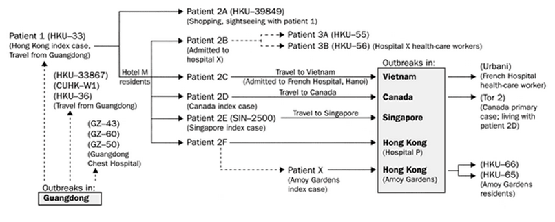
The causal inflection paths for the 2004 SARS outbreak (Beautiful Evidence p 78-79) is shown. He emphasizes the annotated on the causal lines as critical to understanding.
Ethics of Data Vis
ET give a fatherly heart-to-heart chat about the responsibilities and ethics of presentation. He contrast the presenter (producer of information) with the audience (consumer of information). Presenters often failed with their focus on establishing credibility rather than a sincere desire to report and explain. Be as transparent and open as possible, giving references to both pro and con arguments. Respect your audience and their high intellect. Think good thoughts and the best about your audience. Do anything to explain clearly. Avoid hollow jargon words, like ‘immersive’ or ‘disruptive’. Never conclude since great geniuses have never concluded their great ideas. On the other hand, audience often fail with intent of being entertained with an ’empty head’ rather than an ‘open mind respective to new ideas’. Pay attention! Give your undivided attention. Stay on the content. And hack the ideas! Cherry-pick ideas and extend into new thoughts.
Go Into The Field
Go into the field and directly observe how the data was collected. Get out and look! Numbers are not the real world. Numbers are biased by the people that collect them, even with IoT [my addition]. Do not have people keep their own score. IOW separate the people who cause the data from the people that collect the data.
Search on Google Images, not with Google Words. More bang per page! Use small multiples, as in Beautiful Evidence, p 32-33. Sparkline examples came next. This is an ET favorite! The principle was to separate information by the mode of production (which I am still pondering).
Glory Days With 4K Panels
ET finished (not concluded) with thoughts on display surfaces. This is the ‘glory days’ for data viz now that we have display technology like 4K panels. You can do 3D without 3D displays, as we have for centuries. Dimensional compression can flatten data to 2D if properly designed. For example, the slow video pan of the Swiss maps conveys the depth perception of any 3D display. “If string theory is correct, there are probably 11D people who are yearning for 12D displays.” Use your 2D media to escape to the real 3D land. And finally, he carefully held up to the audience an original manuscript of Galileo, noting the mastering of illustration and explanation.
Key Points
Blocks of numbers with words (and even sentences) are effective. Annotate lines with words. Eliminate anything that does not convey information to the viewer. Science publications (especially Nature) are at the cutting edge of data viz. All should strive to the quality and clarity of data viz (and especially storytelling techniques) in the NYTimes. Do anything to explain.
In Summary
If you are into data viz, you must be well versed in the works and ideas of Edward Tufte. You do not have to agree with all his edicts, but the contrast will raise the quality of your arguments. He does have his favorites and pet peeves (powerpoint!), as do all of us. Do a little filtering and look for the hidden gems. For instance, his fixation on paper as the primary medium seems quaint and maybe antiquated. However, if you listen between the sentences, you realize that there is a rich history and enduring lessons to leverage as we evolve into ‘smart paper’ (as he lovingly references retinal tablets and 4K panels).
One could be repulsed by ET’s opinionated style and his store of books, workshops and materials. I was initially. Then I realized that each opinion (however frivolous) has a lot of thought behind it (sometimes buried on his website or book). And his goods for sale? High quality, reasonably priced, and discounted for educators/students.
Archive blog originally posted on August 3, 2015